
And that little Earth on there is basically the symbol of the Mother series (well, in Smash Bros. anyways). Back a while ago, there was a post on EarthBound Central that showed that the earth is actually based off the famous picture of the Earth, Blue Marble, upside down: http://earthboundcentral.com/2010/08/the-world-is-mother/
Although they don't match exactly (the Mother version is just a bit more simplified) they still match up pretty well. So why am I talking about this? Well, before I knew about the whole Blue Marble thing, I thought that the Earth in the logo was deliberately made to have certain things in it. What things? Well, I'll show you.
This all started when I got too close to my TV while playing Brawl and started inspecting the little logo. Firstly, I saw an M on the Earth and I was all like "Oh cool, M for Mother!"
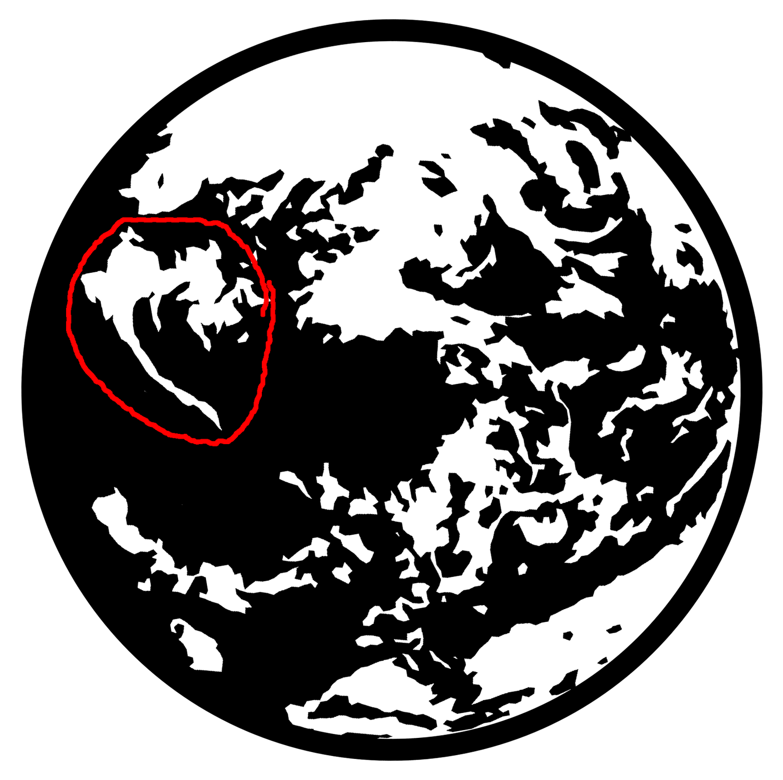
Looks an awful lot like an M, doesn't it? And then I saw something else, and you may have to keep an open mind for this, but I saw what looks like an alien's head, Giygas' (not his Mewtwo-like form) head to be specific.

Still don't see it? Here:

I admit that it might just be me seeing this, but for some reason it reminds me of Giygas. Let's compare:
Hmm, it actually looks more plausible than I thought it would side-by-side. Juxtaposing these pictures made me wonder; is the some insane weird chance that maybe that little "face" in the logo inspired Giygas' design? Probably not, but hey, this isn't Over Analyzations of EarthBound for nothing.
It might be a little late but... Finally someone who has brought up something about the Earthbound logo. But it's just a classic case of pareidolia, the logo is actually a pixelized image of the famous picture of Earth known as, "The Blue Marble" (You'll recognize it if you look it up.) That M-shaped cloud is on the image too. Originally the image was taken upside down, but to appeal to the larger masses of people the image was flipped resulting in the image we all know. The only reason the Earthbound logo looks so different is because it's upside down. That Giygas shape is in the original photo too, so maybe Giygas is among us!
ReplyDelete